Why Some Photos Just Look Better (And It's Not the Camera)
After taking thousands of photos, I've noticed patterns in the ones that actually work. Here's what I've figured out about composition.
Why Some Photos Just Look Better (And It's Not the Camera)
I've been thinking about this a lot lately. I'll take 50 photos on a weekend walk, and maybe 3 of them actually look good. Same camera, same settings, same light. So what makes the difference?
After looking through thousands of my own photos (and deleting most of them), I've started to notice some patterns in the ones that actually work.
The Rule of Thirds (And When I Ignore It)
Yeah, everyone talks about the rule of thirds. Put important stuff on the lines, not in the center. I get it, and it works... most of the time.
But honestly? Some of my favorite shots break this rule completely. That perfectly centered canal reflection in Amsterdam? Dead center, and it looks great.
I think the real rule is: if it looks balanced, it probably is.
Lines That Actually Lead Somewhere
This one took me forever to understand. Photography articles always talk about "leading lines," but they never mention that the lines should actually lead to something interesting.
I used to photograph every path, fence, and shoreline I saw. Most of those photos are boring because the line doesn't go anywhere worth following.
What I've learned: The line should lead to your main subject, not just... off the edge of the frame into nothing.
Foreground, Background, and the Stuff in Between
This is probably the biggest difference between my early photos and the ones I like now. I used to just point and shoot at whatever caught my eye.
Now I try to think in layers:
- Something close (rocks, flowers, whatever)
- The main thing I'm photographing
- Something far (mountains, buildings, sky)
It's like giving the photo depth, making it feel less flat. Though sometimes I still forget and end up with photos that look like cardboard cutouts.
Colors That Don't Fight Each Other
I never thought about color in photography until I noticed some photos just felt more... harmonious?
Colors that seem to work well together:
- Blue and orange (classic sunset combo)
- Green and brown (nature's default palette)
- Different shades of the same color (all blues, all greens)
What doesn't work: Every color in the rainbow all at once. I learned this the hard way photographing a flower market.
The Power of Empty Space
This one blew my mind when I figured it out. Sometimes the empty parts of a photo are just as important as the full parts.
I used to try to fill every corner of the frame. Now some of my favorite shots are mostly empty sky or water, with just one interesting thing in a corner.
Example: That lone tree in a big empty field looks way more dramatic than a tree surrounded by other trees.
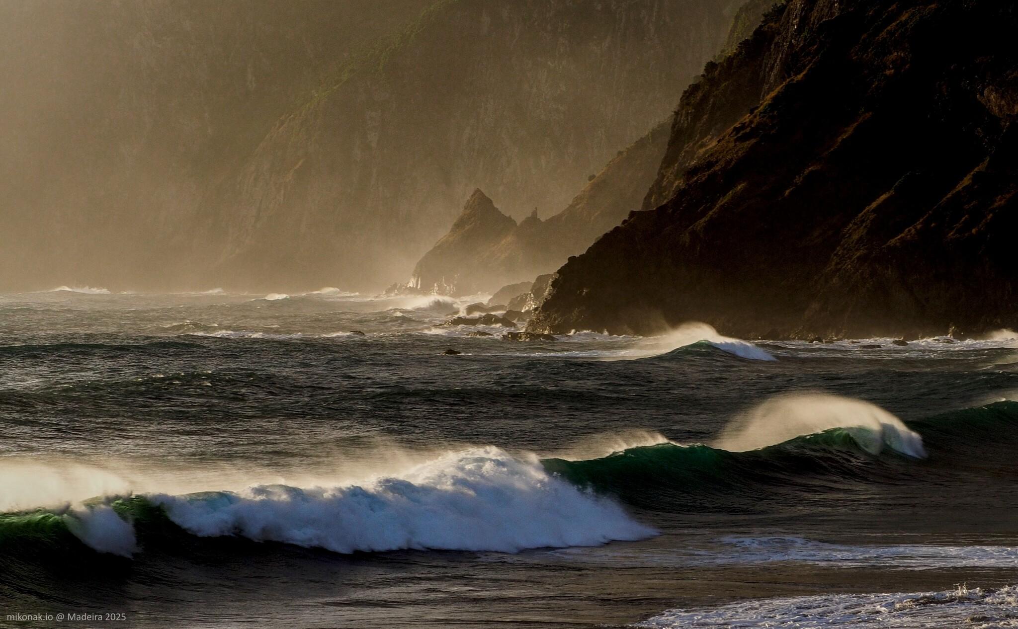
When Light Makes or Breaks Everything
Same subject, different light = completely different photo. I've learned this by taking the same shot at different times and being amazed at the difference.
Good light can make boring subjects interesting.
Bad light can ruin interesting subjects.
I'm still figuring out what "good light" means, but I know it when I see it. Usually it's not harsh midday sun.
Patterns I've Noticed in My Better Photos
Looking through my Lightroom catalog, the photos I actually like tend to have:
- One clear main subject - not five things competing for attention
- Some kind of depth - foreground and background, not just a flat wall
- Balanced colors - not fighting each other
- Clean edges - I'm not accidentally cutting off important stuff
- Interesting light - not just "good enough" light
Mistakes I Keep Making
- Tilted horizons when I'm not paying attention
- Distracting stuff in the background I didn't notice while shooting
- Too much in the frame - trying to include everything instead of focusing on one thing
- Forgetting to check the corners before hitting the shutter
What Actually Helps Me Improve
Looking at my old photos: Painful but educational. I can see what I was trying to do and why it didn't work.
Taking fewer, more thoughtful shots: Instead of spray-and-pray, I try to really look at what I'm photographing.
Studying photos I love: Not just photography - paintings, movie scenes, even good Instagram posts. What makes them work?
The Netherlands Composition Challenge
Shooting landscapes here is different from those dramatic mountain photos you see everywhere. Everything's pretty flat, the light is often soft and gray, and there aren't many obvious "wow" subjects.
This has actually made me better at composition because I can't rely on dramatic natural features to carry the photo. I have to make boring Dutch countryside look interesting through framing and timing.
My Current Approach
- Find something that interests me (could be light, a building, a reflection)
- Move around it - try different angles, heights, distances
- Think about what's in the background before shooting
- Take a few shots with slightly different compositions
- Actually look at the photo on my camera screen before moving on
The Real Secret
Here's what I think it comes down to: paying attention.
Good composition isn't about following rules perfectly. It's about really looking at what you're photographing and being intentional about how you frame it.
Most of my bad photos happen when I'm rushing or not really looking. The good ones happen when I slow down and actually see what I'm trying to capture.